That's a fun project\! Based on the subfolders found on the site, I've generated the HTML and CSS for a responsive landing page with tiles for each story.
-----
### 1\. HTML (`index.html`)
This structure assumes the following:
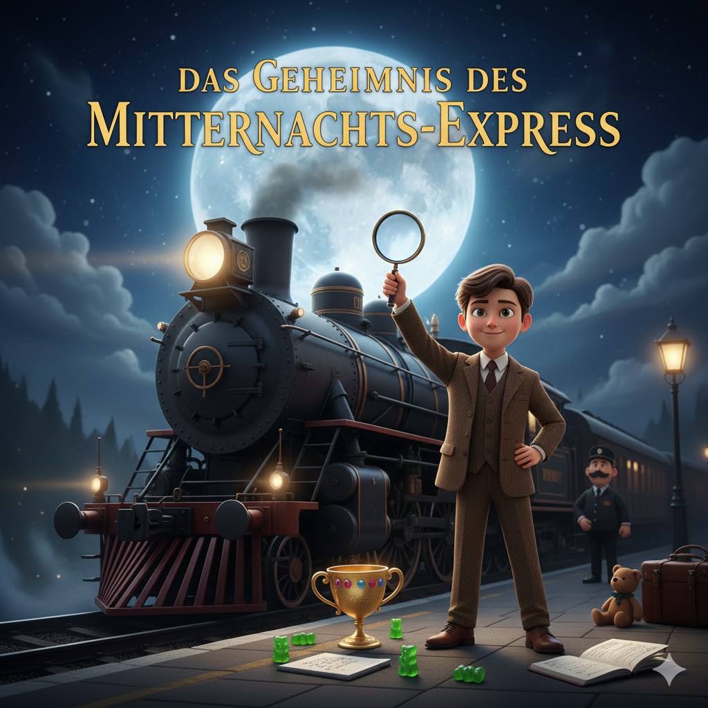
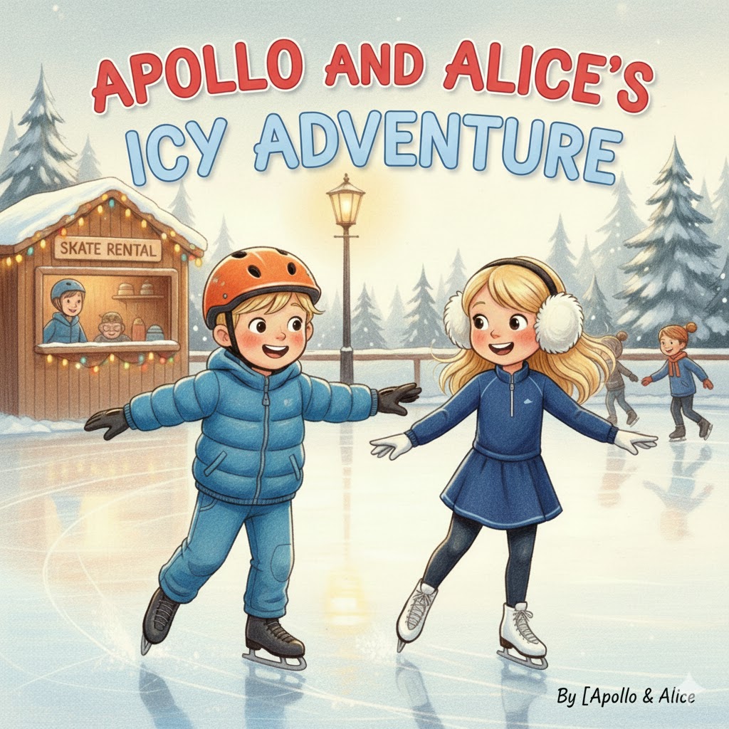
1. The main HTML file for each story is named **`index.html`** inside its subfolder (e.g., `Apollo_Pokal/index.html`).
2. The tile image for each story is named **`cover.jpg`** inside its subfolder (e.g., `Apollo_Pokal/cover.jpg`). **You must ensure the images are named `cover.jpg` in each folder, or update the image paths below.**
```html
Tesana Stories - Children's Tales
```
-----
### 2\. CSS (`style.css`)
Save this code as **`style.css`** in the same directory as the `index.html` file. This styling creates a nice, modern, and responsive tile layout suitable for a children's story site.
```css
:root {
--primary-color: #3f51b5; /* Indigo */
--accent-color: #ff9800; /* Orange */
--background-light: #f4f7f9;
--text-dark: #333;
--tile-bg: #fff;
--tile-shadow: 0 4px 8px rgba(0, 0, 0, 0.1);
}
* {
box-sizing: border-box;
margin: 0;
padding: 0;
}
body {
font-family: 'Roboto', sans-serif;
background-color: var(--background-light);
color: var(--text-dark);
line-height: 1.6;
}
/* Header Styling */
header {
background-color: var(--primary-color);
color: white;
padding: 40px 20px;
text-align: center;
box-shadow: 0 2px 4px rgba(0, 0, 0, 0.1);
margin-bottom: 30px;
}
header h1 {
font-size: 2.5em;
margin-bottom: 10px;
}
header p {
font-size: 1.1em;
opacity: 0.9;
}
/* Story Grid Layout (Tiles) */
.story-grid {
display: grid;
/* Responsive Grid: 1 column on small screens, 2-4 on larger */
grid-template-columns: repeat(auto-fit, minmax(280px, 1fr));
gap: 30px;
padding: 0 20px 50px;
max-width: 1200px;
margin: 0 auto;
}
/* Individual Tile Styling */
.story-tile {
background-color: var(--tile-bg);
border-radius: 12px;
overflow: hidden;
box-shadow: var(--tile-shadow);
transition: transform 0.3s ease-in-out, box-shadow 0.3s ease-in-out;
}
.story-tile:hover {
transform: translateY(-5px);
box-shadow: 0 10px 20px rgba(0, 0, 0, 0.2);
}
/* Link Styling (to make the whole tile clickable) */
.story-tile a {
text-decoration: none;
color: inherit;
display: block; /* Make the anchor tag fill the tile */
text-align: center;
}
/* Image Styling */
.story-tile img {
width: 100%;
/* Fixed aspect ratio for consistent tile height */
height: 250px;
object-fit: cover;
display: block;
border-bottom: 1px solid #eee;
}
/* Title Styling */
.story-tile h2 {
font-size: 1.4em;
padding: 15px 10px;
color: var(--primary-color);
}
/* Footer Styling */
footer {
text-align: center;
padding: 20px;
background-color: var(--primary-color);
color: white;
font-size: 0.9em;
margin-top: 30px;
}
```